Métamorphe - Design System
How I created a Design System for WhiteLabel products.

What is Design System
Design System is a set of rules and components for a given digital product, taking into account consistency, standardization and brand identity, to guide the development of interfaces.
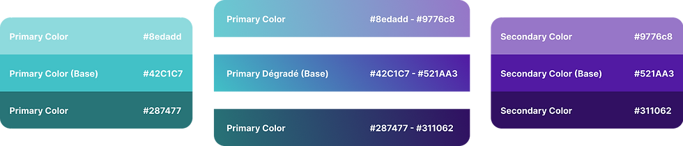
Brand Colors
Used as main colors for UI and components.
Status colors
Used to define the statuses of a certain action during the execution of a task.

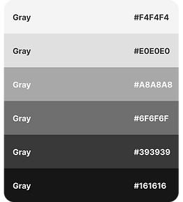
Grey scale
Mainly used as layout and text colors to create contrast in the interface.
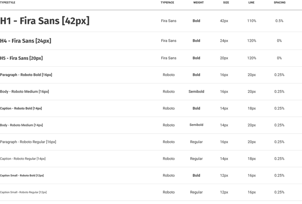
Fonts
ROBOTO and FIRA SANS fonts were used.
Icons
Material Design icons were used.
Buttons and Inputs
Some rules were created to guarantee the good use of the buttons and inputs created
Switch
Use the toggle switch if you:
-
Applying a system state, not a contextual state
-
Introducing Binary Options, Not Opposites
-
Activating a state, not performing an action

Checkbox
Checkboxes are used for multiple choices, not mutually exclusive choices. Each checkbox works independently of other checkboxes in the list, so checking an additional box does not uncheck the others already selected.

Radio Button
Radio Buttons (multiple choice) are used for mutually exclusive choices and the user must select exactly one option. When a user chooses a new item, any other choice is automatically deselected.

Selection
The selection component allows users to choose an option from a list. It is used in forms for users to submit data.

Forms
All forms are composed of labels, placeholder, validation and input fields.
Labels and placeholder
The labels tell users what the corresponding input fields mean, and the placeholder gives hints about what goes into a field. Placeholder text is optional.

Validation and feedback
Informs whether the data submitted by the user conforms to acceptable parameters.

Input Fields
Allows users to provide information. Information can be entered via a variety of different input fields ranging from text fields, checkboxes and many other types.

Home Buttons
-
The color of the icons, the writing and the color of the button must not be changed
-
The distance between buttons should be 8px
-
Rounding the edges with a radius of 8
-
Shading (box-shadow) Blur 4, Y 1, 25% opacity

-
The color of the icons, the writing and the color of the button must not be changed
-
The distance between buttons should be 16px
-
Rounding the edges with a radius of 16
-
Shading (box-shadow) Blur 4, Y 1, 25% opacity

Main Buttons
The main buttons are used for the main actions of the application. The width, height or rounding must not be changed (with exceptions), and the order between the primary, secondary and tertiary buttons must be respected.

applications
The buttons must respect a hierarchy and spacing.

Password Input
They are unique to short, numeric passwords. It can occur in 4-digit password confirmation, email and SMS confirmation.

Password aplication

System and Interface
Tab bar
It maintains easy and quick access to the main actions of the application.
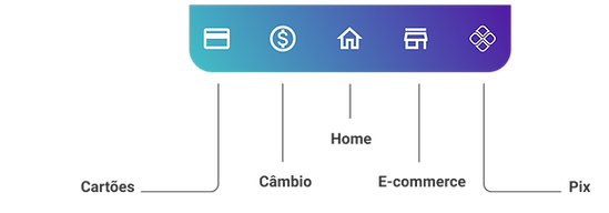
All buttons can be changed according to the end user's preferences, that is, the functions most used by the user. With the exception of the Home button, which will remain fixed.
The Cards, Investments, Home, E-commerce and Pix functions are born native.
The user will be able to choose between changing the functions according to his choice, or leave it in automatic mode, which prioritizes the most used functions.

Navigation bar
Used when the current page has a title and you can go back to the previous page.

Navigation bar
Used when the current page does not have a title and you can go back to the previous page.

Navigation bar
Used when the current page has a title and you cannot go back to the previous page.
Navigation bar
Used when the current page does not have a title and you cannot go back to the previous page.

Header
Keeps the customer's brand information and username, and gives access to the account statement and app settings. Used only in the app's home and suffers an intersection of the main menu buttons.

Dividers
They help in the division and hierarchy of information.

Modals
They serve to alert about any error or state of the system that requires immediate action from the user.

Used when the user needs to choose 1 alternative, it closes automatically after the choice, but advances to the next page after being selected.

Used when the user needs to choose 1 alternative, it closes automatically after the choice, but advances to the next page after being selected.

Used when the user needs to choose 1 alternative, it closes automatically after the choice, but advances to the next page after being selected.

Rating
It serves for the user to evaluate his experience in the application from 1 to 10. The user is not obliged to evaluate, and can evaluate using only the stars, the comment is optional.

White Label Application

Métamorphe
The Métamorphe Design System was created to meet a need for whitelabel products. It is worth remembering that a Design System has no end and is constantly evolving.